All case studiesUI / UX design

Tekra · case study

Designing a clear UI for a genuinely complex system

Tekra is an enterprise RPA & process-automation platform — orchestrator, no-code process designer, robots, approvals, governance. It had a powerful backend and no interface. We designed the entire product experience from scratch.

tekra · orchestrator
Tekra process health & monitoring screen
46screens designed
990+frames & states
4KPI dashboards
Light · dark+ system theming

The challenge

A powerful engine no one could drive

Tekra automates business processes end-to-end — but everything lived in the backend. Operations leads, process owners and auditors had no way to build, run, monitor or trust their automations. The job: turn a deeply technical system into a product a non-engineer can use confidently — without dumbing down its power.

What we designed

Information architectureA full navigation map taming dozens of modules into a clear, learnable structure.
Orchestrator & dashboardsHome, processes, robots, triggers, approvals, logs — real-time monitoring at a glance.
No-code process designerA BPMN drag-and-drop studio so non-engineers can model automations visually.
Process Health & KPIsFour analytics boards (effectiveness, quality, governance, automation) with a 0–100 health score.
Design systemTokens, a full component library and light / dark / system theming for consistency at scale.
Every state coveredAuth, onboarding, empty, loading, error, offline, permissions — nothing left undesigned.

Inside the design

tekra · orchestrator › dashboard
Tekra orchestrator dashboard
Orchestrator home — KPIs, robot status and process performance, personalised and scannable.
tekra · orchestrator › effectiveness
Tekra process effectiveness KPI dashboard
Process Effectiveness — cycle-time trends, per-process breakdown and AI-driven recommendations.
tekra · navigation map
Tekra navigation sitemap
The full information architecture — how we made a sprawling system feel navigable.

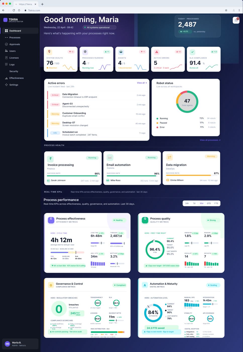
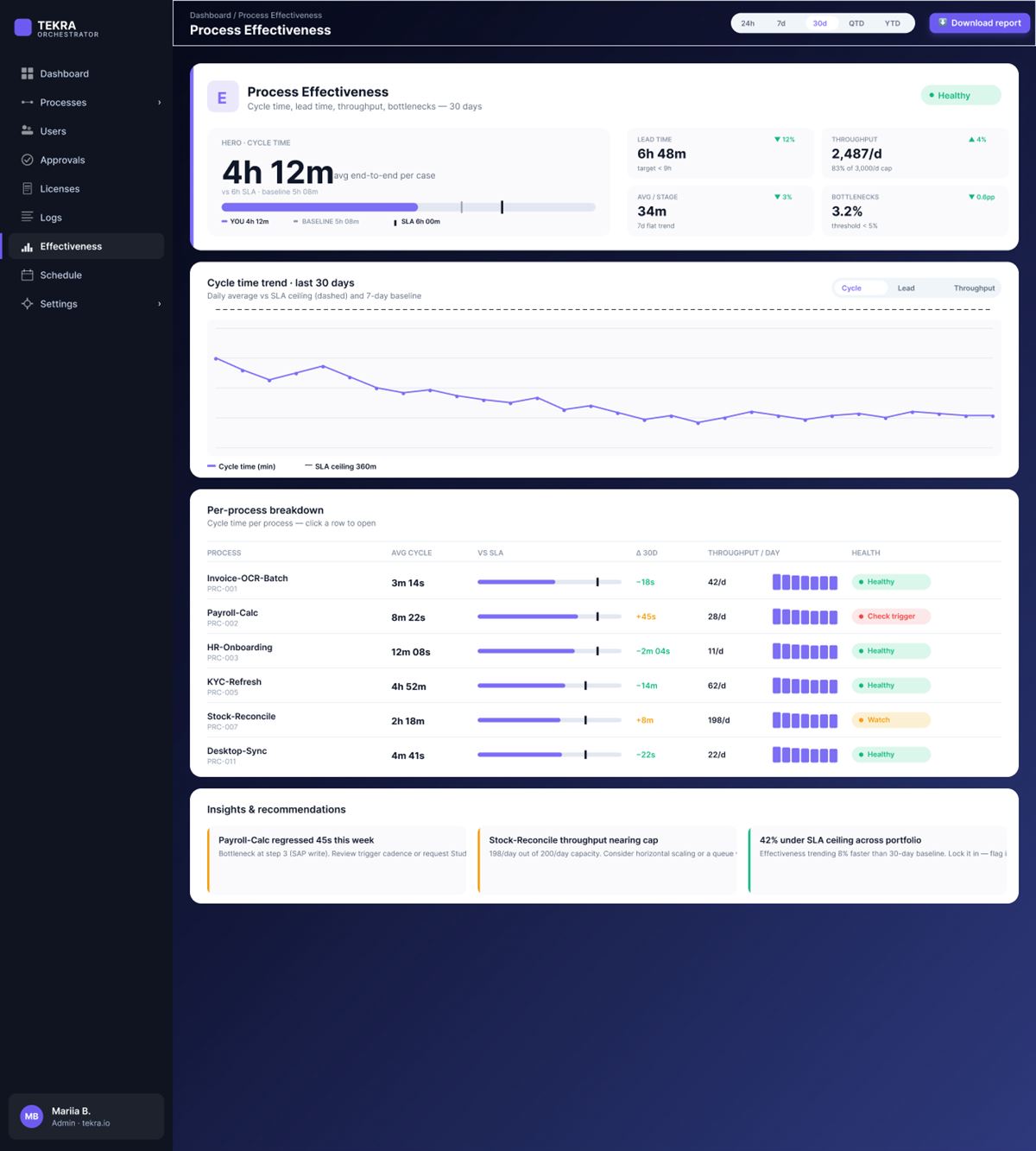
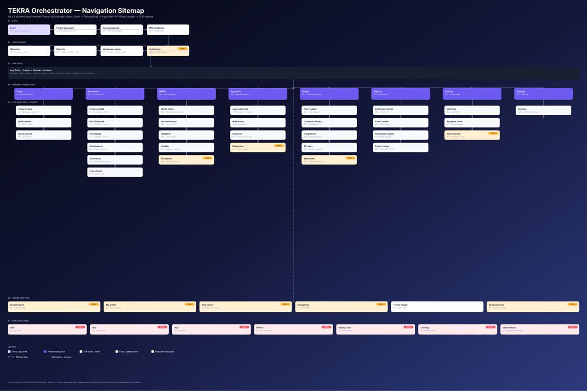
The UX practices we applied

IA & progressive disclosureComplexity revealed in layers, never all at once.
Design tokens & themingOne source of truth; light, dark and system modes.
Data-dense, legible dashboardsClear hierarchy so dense data stays readable.
Accessible, state-completeContrast, focus, and every empty/error/loading state.
Reusable component libraryConsistency and speed across 46 screens.
Interactive prototypeA clickable flow for user testing and investor demos.

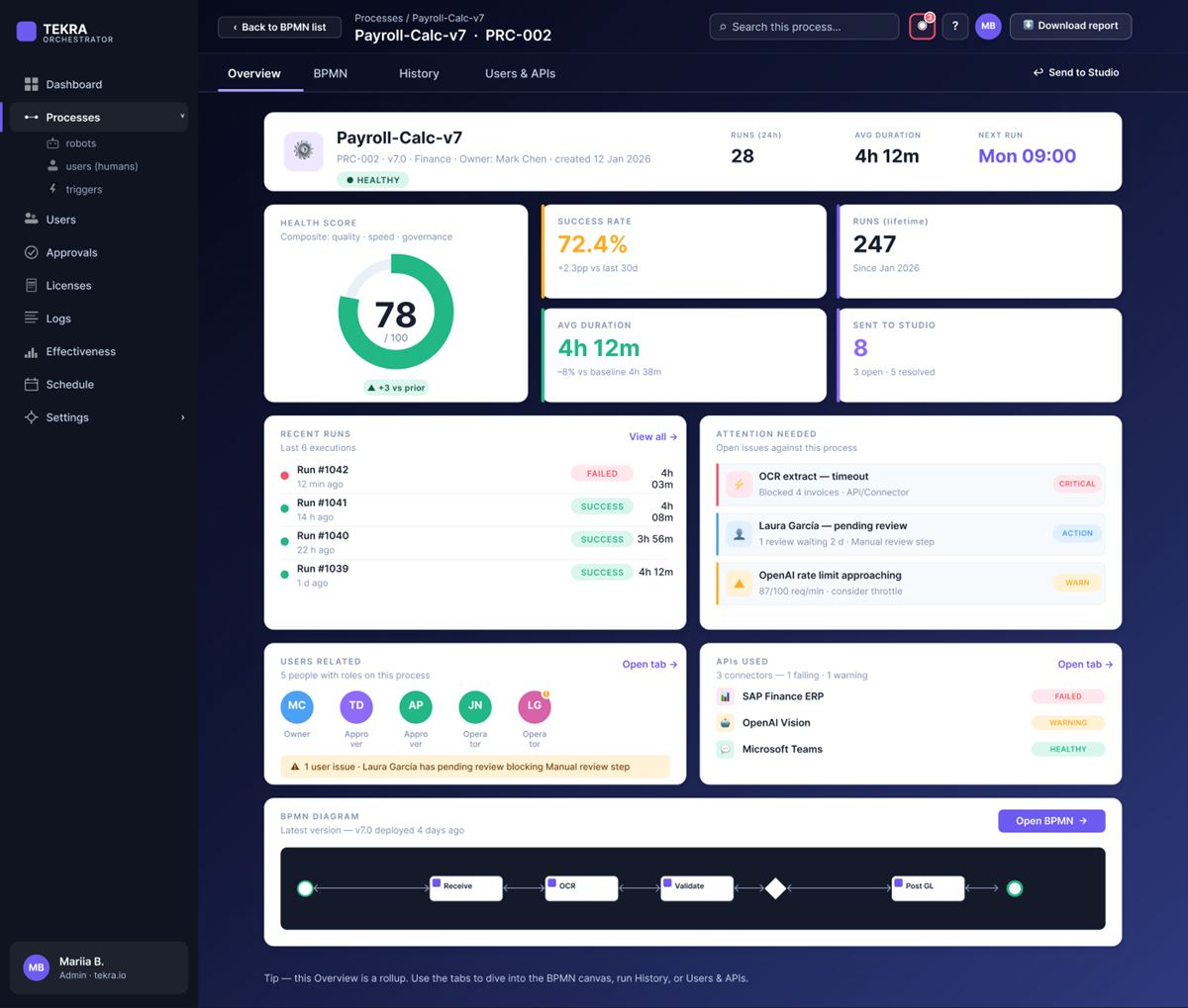
Signature detail: the Process Health score

“One 0–100 number that tells you if an automation is healthy — at a glance.”

We designed a composite health score so operators don’t have to read five charts to know if a process is in trouble. It weights what matters and colour-codes the result.

35%Time / SLA
25%Cost
25%Quality
15%Automation
≥80Green = healthy

Got a complex system that needs a human-friendly UI?

We design end-to-end product experiences — from information architecture to a full, themeable design system.

Start your diagnostic
Scroll to Top